
G3 Art vocabulary helps students explain what they can see, why an artist made a choice and how an idea develops into a finished visual response. The difference between tone and colour, observation and interpretation, or a sketch and a final design can change an entire answer. This guide provides 200 usable Art terms with short definitions and examples for visual analysis, exploratory sketching, artworks, creative experiments and portfolio reflection.
Singapore’s 2027 Secondary Education Certificate G3 Art is syllabus K347 (previous reference code 6114). The subject develops students as active artists and informed viewers. The 2027 examination combines Paper 1 Visual Response (50%) and Paper 2 Portfolio (50%). The glossary below is independently curated by eduKate; it is not an official compulsory 200-word list. Some terms support broader art understanding, and students should always follow the exact assessment brief.
Quick answers:
- In a visual analysis answer, begin with what is actually visible before interpreting it.
- A named technique is useful only when the student explains its effect in the work.
- For exploratory sketching, show a developing idea through meaningful visual alternatives, not only a polished result.
- The portfolio includes up to 15 screens of selected visual materials across at least three art forms and media.
- The portfolio commentary is based on three works, within 800 words and under 10 A4 pages.
- Record sources, experiments and revisions truthfully; credit other creators.
1–10: Observe and describe art
- observation — Deliberate attention to visible details.
- visual analysis — Study of how an artwork’s visual choices create meaning.
- interpretation — Reasoned explanation of an artwork’s possible meanings.
- visual evidence — Specific visible feature supporting an interpretation.
- subject matter — Objects, people or ideas depicted.
- context — Circumstances surrounding the creation or viewing of art.
- artistic intention — What an artist aims to explore or communicate.
- visual language — Ways forms, colours and arrangements communicate ideas.
- perspective — A viewpoint from which something is understood.
- visual literacy — Ability to read, create and discuss visual images.
Use it: Choose one visible feature in an artwork and name it accurately.
11–20: Elements: line and shape
- line — Mark describing direction, movement or a boundary.
- contour — Outline defining an object’s shape.
- gesture drawing — Rapid drawing capturing a subject’s movement.
- hatching — Shading with sets of close parallel lines.
- cross-hatching — Shading with intersecting line groups.
- weight of line — Relative thickness or darkness of a line.
- shape — Two-dimensional area with a boundary.
- geometric shape — Form using recognisable mathematical outlines.
- organic shape — Irregular or naturally flowing shape.
- silhouette — Outline of a subject presented as a solid mass.
Use it: Describe how changing this feature would alter a viewer’s impression.
21–30: Elements: tone and value
- tone — Lightness or darkness of a colour or surface.
- value — Relative lightness or darkness.
- highlight — Area where light is strongest.
- shadow — Region less exposed to illumination.
- mid-tone — Value between the brightest and darkest parts.
- contrast — Noticeable difference between visual elements.
- chiaroscuro — Strong use of light and dark for dramatic modelling.
- gradient — Gradual change from one value or colour to another.
- cast shadow — Shadow projected by an object onto another surface.
- reflected light — Light bounced onto a subject from surrounding surfaces.
Use it: Sketch two alternative ways to express one idea and label the differences.
31–40: Elements: colour
- hue — Basic family of a colour such as red or blue.
- saturation — Intensity or purity of a colour.
- tint — Colour lightened by adding white.
- shade — Colour darkened by adding black.
- warm colours — Colours often associated with red, orange and yellow.
- cool colours — Colours often associated with blue and green.
- complementary colours — Colours roughly opposite on a colour wheel.
- analogous colours — Colours adjacent on a colour wheel.
- colour palette — Selected range of colours used in a work.
- colour harmony — Relationship among colours that creates an intended unity.
Use it: Explain how a chosen material or process relates to artistic intention.
41–50: Composition and arrangement
- composition — Organisation of visual elements in an artwork.
- balance — Distribution of visual weight.
- symmetry — Correspondence across a central line or point.
- asymmetry — Unequal arrangements that may still achieve balance.
- emphasis — Visual prominence given to an element.
- focal point — Area drawing a viewer’s attention.
- rhythm — Repeated arrangement suggesting visual movement.
- repetition — Recurring use of an element or pattern.
- unity — Sense that parts of a work belong together.
- variety — Differences that introduce interest and contrast.
Use it: Choose one visible feature in an artwork and name it accurately.
51–60: Space and depth
- positive space — Area occupied by the main forms.
- negative space — Area surrounding or separating forms.
- foreground — Part of a scene appearing nearest to viewers.
- middle ground — Area between near and distant parts of a scene.
- background — Part of a scene appearing furthest away.
- overlap — One form covering part of another.
- linear perspective — Method using converging lines to suggest depth.
- vanishing point — Point where projected parallel lines appear to meet.
- horizon line — Apparent line at a viewer’s eye level in perspective.
- foreshortening — Depiction of a form compressed by its viewing angle.
Use it: Describe how changing this feature would alter a viewer’s impression.
61–70: Form and three-dimensional effects
- form — Three-dimensional shape or represented volume.
- volume — Space occupied by a three-dimensional form.
- mass — Perceived solidity or weight of a form.
- proportion — Relative size relationships among parts.
- scale — Size of something relative to a reference.
- structure — Arrangement that gives a form stability or organisation.
- plane — Flat or apparently flat surface defining a form.
- modelling — Creation of the impression of three-dimensional volume.
- texture — Surface quality seen or felt.
- surface treatment — Method used to alter the appearance or feel of a surface.
Use it: Sketch two alternative ways to express one idea and label the differences.
71–80: Sketching and idea generation
- thumbnail sketch — Small drawing exploring a possible idea.
- exploratory sketch — Drawing used to test a visual possibility.
- annotation — Short written explanation beside an image.
- visual brainstorming — Generating possibilities through images and marks.
- iteration — Repeated development informed by reflection.
- variation — Alternative version of a chosen concept.
- visual research — Gathering images and observations to inform making.
- concept sketch — Drawing expressing a central creative idea.
- cropping — Selecting which part of an image remains visible.
- experimentation — Testing materials, forms or processes to discover effects.
Use it: Explain how a chosen material or process relates to artistic intention.
81–90: Drawing media and techniques
- graphite — Drawing medium commonly found in pencils.
- charcoal — Dark drawing material producing rich tonal marks.
- pastel — Pigment-based drawing medium in stick form.
- ink — Liquid colouring medium used for lines and washes.
- wash — Thin, diluted layer of colour or ink.
- blending — Softening transitions between marks or colours.
- stippling — Building tone through repeated dots.
- smudging — Blurring dry media to soften edges.
- erasure — Removing or lifting marks to correct or develop highlights.
- mixed-media drawing — Combining different materials in one drawn work.
Use it: Choose one visible feature in an artwork and name it accurately.
91–100: Painting processes
- watercolour — Painting using water-diluted pigments in a binder.
- acrylic paint — Fast-drying pigment held in acrylic polymer medium.
- oil paint — Pigment mixed with drying oil.
- gouache — Opaque water-based paint.
- underpainting — Initial painted layer establishing structure or colour.
- glazing — Applying transparent colour over a dry layer.
- impasto — Applying paint thickly to create visible texture.
- dry brush — Applying relatively little paint with a brush.
- wet-on-wet — Putting wet pigment onto a wet surface.
- wet-on-dry — Putting wet pigment onto a dry surface.
Use it: Describe how changing this feature would alter a viewer’s impression.
101–110: Printmaking and editions
- printmaking — Making images by transferring marks from a prepared surface.
- relief printing — Printing from raised parts of a block.
- intaglio — Printing ink held in recessed marks of a plate.
- monoprint — Print made using a process yielding a unique impression.
- stencil — Mask guiding where colour or ink can pass.
- screen printing — Passing ink through a prepared mesh stencil.
- linocut — Relief print made from a carved linoleum block.
- plate — Prepared surface used to make a print.
- edition — Set of impressions produced from a print matrix.
- registration — Aligning paper and colour layers during printing.
Use it: Sketch two alternative ways to express one idea and label the differences.
111–120: Sculpture and construction
- sculpture — Three-dimensional art created in varied materials.
- assemblage — Artwork formed by arranging found or constructed objects.
- carving — Removing material to reveal a form.
- modelling clay — Pliable material shaped into a three-dimensional form.
- casting — Forming an object by pouring material into a mould.
- armature — Internal support used to hold a sculptural structure.
- maquette — Small model of a proposed sculpture.
- installation art — Artwork arranged within a particular space.
- site-specific art — Work made for a particular location.
- kinetic art — Artwork incorporating actual or implied movement.
Use it: Explain how a chosen material or process relates to artistic intention.
121–130: Photography and image making
- photography — Creating images by recording light.
- framing — Choosing what enters the image boundary.
- camera angle — Direction from which a scene is photographed.
- viewpoint — Position from which a subject is seen.
- depth of field — Range of distances appearing acceptably sharp.
- exposure — Amount of light recorded in making an image.
- aperture — Adjustable opening controlling light reaching a camera sensor.
- shutter speed — Duration a camera captures light.
- visual narrative — Story communicated through ordered images or composition.
- photo sequence — Series of photographs related by purpose or theme.
Use it: Choose one visible feature in an artwork and name it accurately.
131–140: Digital visual media
- digital illustration — Artwork made using digital drawing tools.
- raster image — Image built from pixels.
- vector graphic — Image described through scalable shapes and paths.
- pixel — Smallest addressable picture element in a raster image.
- layer — Separate editable level within digital artwork.
- opacity — Degree to which an element blocks what is behind it.
- digital collage — Composition combining separate digital images.
- image editing — Changing a digital image using tools.
- colour grading — Adjusting the overall colour appearance of an image.
- digital provenance — Record of an image’s origin and changes.
Use it: Describe how changing this feature would alter a viewer’s impression.
141–150: Ideas and conceptual art
- concept — Core idea guiding an artwork.
- metaphor — Image or form standing for another idea.
- symbolism — Use of elements to suggest larger meanings.
- allegory — Extended symbolic representation of an idea.
- motif — Repeated image or form carrying meaning.
- juxtaposition — Placing different elements together for comparison.
- ambiguity — Potential for several supported readings.
- narrative — Story or sequence implied through visual material.
- identity — How people understand themselves or belong to groups.
- memory — Recollection of past experience explored through art.
Use it: Sketch two alternative ways to express one idea and label the differences.
151–160: Culture and society
- cultural heritage — Practices and creative works transmitted across generations.
- representation — How people, subjects or identities are portrayed.
- stereotype — Oversimplified portrayal of a group.
- appropriation — Use of another culture’s forms without adequate context or respect.
- art history — Study of creative works across time and cultures.
- patronage — Support or funding given to artists.
- public art — Art placed in spaces accessible to communities.
- community arts — Creative projects involving local participants.
- social commentary — Art addressing questions or problems in society.
- ethical attribution — Acknowledging creators and sources accurately.
Use it: Explain how a chosen material or process relates to artistic intention.
161–170: Art conversation and critique
- description — Statement of observable visual details.
- formal analysis — Examination of elements, principles and arrangements.
- critical response — Reasoned interpretation and judgement of a work.
- visual comparison — Study of similarities and differences between images.
- evaluation — Judgement of how effectively choices serve intentions.
- justification — Reasons supporting an artistic decision.
- feedback — Information intended to support improvement.
- reflection — Careful consideration of making and learning.
- alternative reading — Another defensible interpretation of the work.
- evidence-based critique — Commentary grounded in visible features and context.
Use it: Choose one visible feature in an artwork and name it accurately.
171–180: Portfolio development
- portfolio — Selected body of work showing development and accomplishment.
- process documentation — Record of decisions, trials and revisions.
- art journal — Ongoing record of observations and artistic thinking.
- artist research — Study of other makers relevant to an intention.
- visual exploration — Experimenting with alternative marks, media and forms.
- development sequence — Ordered progression from initial idea to later outcomes.
- selection criteria — Reasons used to choose work for presentation.
- creative progression — Observable change in ideas and skills over time.
- artistic voice — Distinctive way a person communicates through making.
- curation — Choosing and arranging work to communicate a coherent story.
Use it: Describe how changing this feature would alter a viewer’s impression.
181–190: Communicating artistic development
- commentary — Written explanation of artistic thinking and growth.
- articulation — Clear expression of intentions and decisions.
- citation — Information acknowledging a referenced source.
- source attribution — Naming the maker or origin of borrowed material.
- authenticity — Truthful representation of one’s own work.
- revision — Return to a piece to improve or alter it.
- self-assessment — Judgement of one’s own strengths and needs.
- visual consistency — Relationships that make a set of works feel connected.
- experiment log — Record of trials, conditions and outcomes.
- creative reflection — Consideration of how making changed the artist’s understanding.
Use it: Sketch two alternative ways to express one idea and label the differences.
191–200: Examination response and practical care
- visual stimulus — Unseen image or work supplied to prompt a response.
- exploratory response — Development of visual possibilities from a prompt.
- time allocation — Planning how much working time a task receives.
- annotation clarity — Ease with which written drawing notes can be understood.
- safe handling — Use of materials and tools with appropriate precautions.
- ventilation — Air movement reducing accumulation of harmful fumes or dust.
- material disposal — Proper collection or discarding of used substances.
- archival care — Handling and storage intended to preserve work.
- originality — Development of personally authored choices and forms.
- final presentation — Arrangement of work for viewing and assessment.
Use it: Explain how a chosen material or process relates to artistic intention.
How to use the vocabulary in an unseen Art paper
Imagine an unseen photograph of a school corridor where a single figure stands near the edge of a frame. A student could describe the composition first: the figure occupies a small part of the picture and empty space dominates the rest. That is an observation. An interpretation might be that the arrangement makes the person appear isolated or vulnerable. The student should support that reading with the actual framing, contrast and relationship between figure and surroundings. Saying “it is lonely” without explaining visible evidence is less persuasive.
Now imagine the same person placed centrally, filling the frame, with bright light and strong colour contrast. The new composition may emphasise confidence or presence, but no single camera angle automatically creates one mood. Art analysis connects specific choices, their observable results and a defensible possible meaning. A viewer’s response matters; it must still be grounded in the work.
Example 1: tone, value and colour are related but distinct
In a monochrome drawing, a student can build depth through values ranging from light to dark. Highlights indicate strongly lit areas, mid-tones shape surfaces, and shadows suggest areas receiving less light. When a mark grows darker, that is a change in value even if the hue stays the same. In colour painting, hue describes a colour family, saturation its intensity and value its lightness or darkness. The combination determines whether objects stand out or merge with the surroundings.
Try drawing one ceramic mug using only pencil. Mark the outline, identify the light source, observe the cast shadow and record changes in value. Do not invent black outlines around every boundary if the light and background do not produce one. This small exercise trains observation, accuracy and controlled mark-making—skills that can be used in the larger Art paper.
Example 2: negative space can organise a composition
When an artist draws the gap between two chairs, the negative space can be as important as the chairs themselves. Thinking about the spaces helps check proportion and arrangement. In a visual response, a large empty region may allow attention to settle on one object; in another, it may feel awkward or unfinished. Neither interpretation is automatic. Students should observe whether edges, shapes, colours and repeated marks create an intentional visual relationship.
An exploratory exercise is to make three small thumbnail compositions using one central subject. First position it in the centre, next near an edge, and finally overlap it with another shape. Record what changes in balance, emphasis and mood. Students should not label all variants “good”; the task is to test how choices alter the message.
Example 3: perspective and viewpoint change the meaning of a place
For a Singapore neighbourhood scene, a view taken from ground level may emphasise a pedestrian’s experience, while a higher angle may reveal patterns of paths, buildings and green spaces. Linear perspective can be used to represent depth, with related parallel lines converging towards vanishing points. Foreshortening describes how forms appear compressed at certain viewing angles. These techniques help create believable spatial relationships, but artists may also deliberately distort them to achieve an expressive purpose.
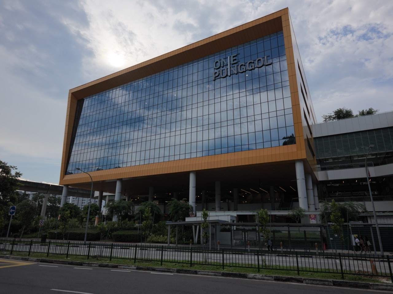
Punggol’s buildings, public walkways and waterfront can serve as subjects for visual study. If photographing people or children, respect privacy and local rules. Students can study architecture, reflections, shadows and vegetation without needing identifiable portraits of strangers. Sketching from observation and taking original photographs can provide authentic starting material for a visual journal.
Example 4: what a useful annotation looks like
A weak note beside a sketch says “interesting colour”. A stronger one states, “I reduced saturation in the background so the brightly coloured umbrella becomes the focal point.” This identifies a decision and explains its function. Another strong annotation might say, “The figure’s scale is too large; I will test a smaller version to create a stronger sense of open space.” It records a problem and a next step. This is more informative than retroactively writing that every experiment succeeded.
Annotations should remain readable and concise, especially in timed exploratory work. They are not substitutes for visual development. A student who writes a paragraph about five ideas but draws only one may be missing the opportunity to test those ideas visually.
Example 5: choose materials for artistic intention
Charcoal can produce strong dark marks and flexible smudging. Watercolour can support transparent washes and luminous layering. Collage brings together fragments from different visual sources, while assemblage extends the idea into three-dimensional forms. Each material has constraints and expressive possibilities. The best choice is not automatically the most expensive medium but the one that supports the intended effect and can be managed skillfully.
A student exploring memory might combine photographs, drawings and found-text fragments. They should distinguish material experimentation from copying someone else’s complete work. Source attribution, copyright awareness and school assessment integrity matter. If a third-party image contributes significantly to the work, the source and its role should be recorded as instructed by the teacher and official assessment requirements.
Example 6: artistic intention needs an observable process
Suppose a student begins with the theme “belonging”. That theme is broad. More useful guiding questions might be: “How can spaces in a neighbourhood communicate welcome or separation?” or “How can repeated journeys be represented through changing forms?” The learner can investigate signs, thresholds, shared spaces and movement; then create sketches, photo studies and physical material experiments. Their final works should show how the ideas evolved, not simply display a title that claims an intention.
Different forms may offer different ways of working. A photographic sequence can document a changing viewpoint; a drawing can emphasise gesture and selective detail; a three-dimensional study can make the viewer move around a form. Asking what each medium contributes helps connect concept, form and intention—a recurring relationship in art-making.
Example 7: reading a public artwork respectfully
An artwork in a public place may draw on cultural symbols, historical references or familiar local materials. The student should identify the visible feature, investigate its credible context and distinguish what the artist stated from what the viewer infers. A symbol does not have one fixed universal meaning across all traditions. Avoid claiming knowledge of an artist’s private intention without evidence; when possible, use exhibition information or the artist’s own published explanation.
Art can invite discussion about identity, memory, community, the environment and changing technology. Those connections are useful even when they lead to differing interpretations. The task is to explain why a reading is plausible, not to invent a single “secret message” that all viewers must accept.
Example 8: how to develop a sketch into a response
Start with one observed image: a cluster of umbrellas on a rainy street. Produce a quick drawing of the main shapes. Test an extreme close-up, then a high viewpoint, then a pattern built from repeating umbrella silhouettes. Compare the emotional or conceptual effect of each arrangement. A chosen direction could be refined by adjusting scale, line weight, positive and negative space and colour. The important evidence is how decisions developed in response to observation and experimentation.
Under timed conditions, students should divide their effort sensibly among reading the prompt, generating ideas, exploring alternatives, identifying a promising concept and making the culminating sketch. One highly detailed sketch may be less convincing than a purposeful visible sequence showing the thinking behind it, particularly where exploratory development is assessed.
Example 9: what portfolio selection means
A portfolio is not simply every image the student has made. It is a curated selection showing artistic exploration, growth, decisions and skill across suitable forms and media. The 2027 K347 Paper 2 requires up to 15 screens in Part A and coverage of at least three art forms/media. This encourages students to reveal breadth and development without filling screens with repeated versions of the same idea.
For Part B, the commentary explains growth based on three works, within 800 words and under 10 A4-sized pages. A useful structure is: initial intention, research or observation, key decisions, experiments that changed the direction, final work and reflective evaluation. Rather than write “I learned a lot”, specify what was learned about form, visual strategy or conceptual meaning.
Example 10: critique is different from dislike
Consider a work intended to convey frantic city movement. A viewer might note that the repeated diagonal lines and crowded shapes create visual energy. Another viewer may find the colour palette too subdued for the intention. Both can be constructive if they describe the evidence and explain the reasoning. A useful critique does not merely say “beautiful” or “bad”. It identifies which decisions support the purpose, which create uncertainty and which could be tested in the next iteration.
Students need not agree with every response. Feedback is information, not an instruction that all personal choices must be abandoned. A reasoned artist can explain why a surprising or deliberately uncomfortable effect is central to the work.
The 2027 K347 examination format
According to the official 2027 G3 Art K347 syllabus, Paper 1 Visual Response lasts 2 hours 15 minutes, has 50 marks and contributes 50%. Section A Visual Analysis is 10 marks and uses an unseen visual stimulus; Section B Exploratory Sketching is a 40-mark practical task inspired by a visual stimulus. Candidates record writing and sketches in the spaces provided.
Paper 2 Portfolio is also 50 marks and contributes 50%. Part A, Selection of Visual Materials, is 30 marks. Part B, Commentary, is 20 marks. The portfolio is completed in 30 hours within 12 weeks and is assessed by the school with external moderation. The syllabus describes the requirements for visual material selection, commentary and ethical attribution. Students should check the official instructions and the school’s administration of portfolio work rather than use outdated 6114 arrangements without verification.
A four-week vocabulary-to-visual-learning plan
- Week 1 — See clearly: choose terms for line, tone, value, colour, shape and space. Make short observed drawings and practise describing what is visible without jumping too quickly to interpretation.
- Week 2 — Compose and explore: use thumbnails to compare balance, emphasis, perspective and negative space. Test three variations of one theme, then explain the decision to develop one further.
- Week 3 — Try media and ideas: experiment safely with two or three forms, documenting materials, questions, outcomes and relevant sources. Do not confuse copying a reference image with original interpretation.
- Week 4 — Analyse and reflect: respond to an unseen stimulus in timed stages, then practise selecting a small group of works and writing evidence-based commentary about personal development.
The right number of terms depends on what the learner already understands. Ten per session is a starting point, but a student who can name “chiaroscuro” and cannot explain the effect of light in a specific work needs practice in analysis, not more jargon.
Common mistakes that reduce clarity
- Technique spotting: naming “contrast” without saying what contrasts and why it matters.
- Mind-reading: assuming the artist intended a meaning without contextual support.
- Too much polish too soon: one final-looking drawing with little exploration.
- Weak annotations: vague praise that does not record a choice or next step.
- Uncredited material: presenting others’ reference images as wholly original.
- Portfolio overload: repeating similar pieces rather than selecting evidence of growth.
- One “correct” interpretation: dismissing defensible alternative readings without testing the evidence.
- Unsafe media use: working with chemicals, blades or sprays without proper procedures and supervision.
Frequently asked questions
Does K347 have a drawing-only paper?
No. Paper 1 combines visual analysis and exploratory sketching. Paper 2 evaluates a portfolio and a written commentary.
How many art forms must appear in the portfolio?
Part A requires exploration including at least three art forms and media, within the maximum visual screens stated in the syllabus.
Can photographs be included in visual exploration?
Artistic photography can contribute to appropriate exploration, provided it meets the brief and school rules. The portfolio must satisfy the syllabus’s form, source and process requirements.
Can a student use digital art?
Digital media can support artistic processes, but the exact permissibility of tools, devices and external assistance must follow the school and assessment instructions.
What is the difference between visual description and interpretation?
Description states what can be seen; interpretation proposes what those visible choices might mean and explains why.
Will memorising 200 techniques guarantee a distinction?
No. Observing, experimenting, thinking visually, communicating intention and developing authentic work matter more than a long vocabulary list.
Can families use Punggol as a drawing location?
Yes. Architecture, reflections, shared spaces and plants can supply useful visual references. Respect privacy, public-space rules and safe access.
Official syllabus and next reading
Check the official 2027 G3 subject index and the G3 Art K347 syllabus for exact assessment and portfolio requirements. Compare with the 200-word Design and Technology guide to see how visual ideation also helps product-making, although K345 and K347 remain different assessed subjects. Art vocabulary is most powerful when it becomes visible thinking, not a list of technical words.
eduKate Punggol original Art glossary, November 2026. Not a prescribed SEAB word list. Students should comply with assessment integrity and material safety rules.


